Related styles:
-
Youtube Umbra
Installs:Created: Jul 23, 2016Last Updated: Apr 14, 2017 -
Created: Mar 03, 2017Last Updated: Apr 23, 2017
-
Created: Mar 08, 2012Last Updated: Jan 06, 2017
-
Created: May 12, 2014Last Updated: Mar 03, 2017
-
Created: Nov 19, 2013Last Updated: Jun 27, 2016
-
Created: Nov 11, 2013Last Updated: Oct 11, 2015
-
Created: Jul 20, 2015Last Updated: Jan 10, 2017
-
Created: Dec 21, 2015Last Updated: Dec 17, 2016
-
Created: Nov 06, 2014Last Updated: Feb 11, 2016


makondo@userstyles deleted this style because of "This style is outdated."
Try Youtube Umbra instead of this deleted style.
See more styles for Youtube
YouTube - for the Night Owls
Description:
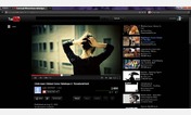
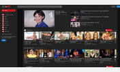
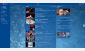
Fx only. Works, see the pic. There's another style for some small images changes, http://freestyler.ws/style/53039/youtube-for-the-night-owls-images (not required for this style to work and look good).
Add: userstyles's userstyles's 66485 , http://freestyler.ws/style/53469/youtube-html5-progress-bar , http://freestyler.ws/style/57066/google-youtube-sign-in-page-for-the-night-owls
The player is enlarged for wide screen, i use 1980X1080 resolution.
Better shots: http://i.imgur.com/1sAcx.jpg & http://i.imgur.com/dnjRj.jpg
NOTICE: I don't comment and don't read comments - they're hidden, comment it if you need it - in the first block of code. If you need help with that, start a new discussion and i will help (no rating needed in this case).
A lot of panels are sized to scroll so that there's no need to scroll the whole page. It looks MUCH better with styled scrolls, like my style userstyles's userstyles's YouTube - Expand+Limit Description Box , for instance. I have other scrollbar styles as well, all should look really nice with this style.
More info
12/11/10 - fixed the grid hover, they changed something again. Thanks to BarbieBarb@userstyles and Sonny@userstyles! Changed the search bar.
12/11 - fixes due to the site changes. The player is larger now, you might to adjust the code for laptops, i believe. Post and i will help (click start discussion link, no rating needed in this case). This is as big as i'm going to make it. If you want it in your face, click the full screen button on the player. Made the new home page wider with the center panel scroll. I use my userstyles's userstyles's YouTube - Expand+Limit Description Box which fits perfectly with this style. If you don't want to see the scrollbar, search this style for 'scroll' and comment it (or delete). I also made the right panel on video pages scrolling. You can now keep watching a video and scroll the 'suggested' right panel at the same time.
03/12 - Thanks, Sonny@userstyles! Hid the alerts bar (like about new privacy policy, etc). If you want it back, search for and delete this line (second block from the top): /* alert bar */. Update due to application changes in Fx13, made 'No description available' text black, no need to click the Show more button needlessly any more, thanks luckymouse@userstyles! Due to the site changes ... again!
05/12 - due to the site changes ... again!
06/12 - touchups for menubars. You can also clean out the homepage by hiding all those 'suggested' panels and have just buttons to sign in and 'Show all' in case you want to browse by category w/out signing in. Here's my personal code for that:
/* ================= hides suggested panels on home page > */
#feed, #video-sidebar, .guide-item-container .guide-item
{ display: none !important; }
.guide-item.guide-item-action.guide-item-fake
{ display: -moz-box !important; }
09/12 - Touchups due to the site changes ... again!
12/12 - due to the site changes ... again!... and again!... and again!... It's getting bloody messy. Will have to do a total re-write. But this hacks work for now. Centered, panels scrollable, the new right tray expands on hover, fixed the new config menus and left panel, etc.
01/13 - hid the footer links, small fixes for all that BS... Hid default avatars, thanks luckymouse@userstyles ! Made the header fixed to be able to search from any page position (panels are no longer scroll, scroll the page works just as well if not better), moved the guide icon .... etc. due to the site changes ... AGAIN!!!
02/13 - fixed subscriptions list, header touchup, fixed font, thanks Sonny@userstyles!
03/16 - a small touchup for the under player stuff
First install FreeStyler to use this style.
If you already installed it, please, make sure this site is allowed to run JavaScript.But you can download Freestyler for other browsers and apply styles there!
Applies to:
youtube.com, https://www.youtube.com/analytics?, http://www.youtube.com/user/, http://www.youtube.com/channel/... More »