
Related styles:
-
Zee complete list of my styles [merci]
Installs:Created: Jul 29, 2012Last Updated: Jul 30, 2012 -
 Created: Nov 07, 2013Last Updated: Nov 15, 2013
 -
 Created: Apr 18, 2015Last Updated: Apr 22, 2015
 -
 Created: Jan 25, 2016Last Updated: Feb 22, 2017
 -
 Created: Dec 06, 2012Last Updated: Sep 08, 2015
 -
 Created: Sep 03, 2016Last Updated: Feb 21, 2017
 -
 Created: Jan 29, 2015Last Updated: Feb 24, 2016
 -
 Created: Jul 25, 2014Last Updated: Mar 08, 2017
 -
 Created: Feb 18, 2014Last Updated: Jan 28, 2016

mod_wastrel@userstyles deleted this style because of "I won't be using anything from Google anymore, and I won't be updating my styles for the Google+ infected apps."
Try Zee complete list of my styles [merci] instead of this deleted style.
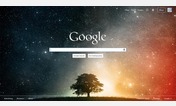
See more styles for Google
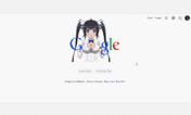
Google Reader - larger and serif plus wider
Description:
Enjoy!
First install FreeStyler to use this style.
If you already installed it, please, make sure this site is allowed to run JavaScript.But you can download Freestyler for other browsers and apply styles there!
Applies to:
http://www.google.com/reader, https://www.google.com/reader