
Related styles:
-
Infolinks and Kontera killer
Installs:Created: Sep 21, 2009Last Updated: Oct 29, 2009 -
 Created: Mar 27, 2011Last Updated: Mar 28, 2011
 -
 Created: Nov 30, 2006Last Updated: Mar 02, 2008
 -
 Created: Sep 21, 2007Last Updated: Nov 05, 2008
 -
 Created: Aug 10, 2007Last Updated: Aug 21, 2011
 -
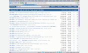 Created: Jan 20, 2008Last Updated: Sep 08, 2012
 -
 Created: Feb 25, 2011Last Updated: Apr 04, 2011
 -
 Created: Dec 18, 2009Last Updated: Sep 09, 2010
 -
 Created: Jun 22, 2007Last Updated: Aug 23, 2010

Max width
Description:
Have you ever tried reading text across 1300 or 1700 pixels? How about those sites that cram everything into the left 800 pixels?
This style creates a maximum 1011 pixel space in the middle of the screen and places the current content inside of it.
Why 1011 pixels? Because that's the usable space on a 1024x768 monitor with a scrollbar. If you use the same stylish.sqlite across multiple computers you won't even notice it on a 1024 monitor. You can adjust this number a couple of pixels either way depending on the width of your scrollbar. Adjust it so that you don't see the borders on a 1024 monitor.
This style is not intended to be used globally, just where a wide screen looks awkward. I've included plenty of examples but you will have to add your own domains and url-prefixes.
You may occasionally see something outside of the box. This usually means that the page you are viewing has styled an element as "position:absolute" and you
First install FreeStyler to use this style.
If you already installed it, please, make sure this site is allowed to run JavaScript.But you can download Freestyler for other browsers and apply styles there!
Applies to:
all URLs