Related styles:
-
Google Hangouts: no decorative images
Installs:Created: Nov 27, 2015Last Updated: Nov 09, 2016 -
Created: Oct 18, 2012Last Updated: Oct 25, 2012
-
Created: Jan 15, 2015Last Updated: Jan 15, 2015
-
Created: Jan 28, 2013Last Updated: Feb 09, 2017
-
Created: Apr 13, 2017Last Updated: Apr 21, 2017
-
Created: Nov 15, 2007Last Updated: Jan 23, 2009
-
Created: Mar 05, 2012Last Updated: Jul 21, 2014
-
Created: Jan 22, 2016Last Updated: Apr 19, 2016
-
Created: Aug 13, 2008Last Updated: Mar 31, 2015

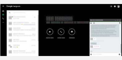


(admin) deleted this style because of "site no longer exists."
Try Gmail: display full address with name instead of this deleted style.
See more styles for Google
Google Reader - just tree and chrome
Description:
Notes:
The tree remains collapsible (click the divider or press "u") -- its side-effect is re-rendering content, so it may be useful while toggling this userstyle on the fly [works nice in FF3].
Background:
Just backup of simple and quick scratch, which came up quite useful; probably there are some similar or even better versions out there ( google reader ), but it was easier for me to write this one instead of finding another.
I am quite loyal Bloglines old-school-user-interface-user who started messing with Google Reader (again, for at least tenth time), and cannot stand its bloated UI. (Try it on 800×600 ;] )(update: switched to gR 'definitely').
Changelog:
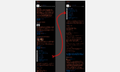
2008-09-15: + screen shots (600×400 px), code clean up
2009-11-02: updated for current gR, simplified, un-obsoleted
2010-02-15: fixed dropdowns menus ("Settings"…); shown "Add a subscription" stuff
First install FreeStyler to use this style.
If you already installed it, please, make sure this site is allowed to run JavaScript.But you can download Freestyler for other browsers and apply styles there!
Applies to:
http://www.google.com/reader/view, https://www.google.com/reader/view