Related styles:
-
Wikia.com no-nonsense.
Installs:Created: Aug 03, 2014Last Updated: Nov 09, 2015 -
Created: Sep 30, 2012Last Updated: Sep 24, 2015
-
Created: Dec 27, 2013Last Updated: Nov 15, 2016
-
Created: Jun 16, 2015Last Updated: Dec 17, 2015
-
Created: Nov 08, 2016Last Updated: Nov 08, 2016
-
Created: May 10, 2015Last Updated: Aug 24, 2015
-
Created: Jul 22, 2015Last Updated: Jul 22, 2015
-
Created: Jan 26, 2017Last Updated: Jan 26, 2017
-
Created: Apr 10, 2017Last Updated: Apr 10, 2017


John_Edward@userstyles deleted this style because of "So much has changed that this would require a complete rewrite."
Try Wikia.com no-nonsense. instead of this deleted style.
See more styles for Wikia
Wikia Dwaedit - Edited New Wikia Look
Description:
I don't hate the "New Wikia Look" itself, I hate the wasted space and the fact that when I am looking at a certain Wiki , I do not want to see links for completely random stuff.
So I made this.
Features:
-Enables New Wikia Look full width content (Just uses the whole space inside, it's still centered)
-Removes the adds
-Removes the unnecessary "WikiaRail"
-Relocates the Search Bar
-Removes most of the WikiaHeader, only leaving the Login
-Removes the toolbar
And generally cleans the layout.
The style also has some transparency options, to fade everything not related to the current article.
Remove the comments in the style to enable them.
Disabling something by removing that section should work too.
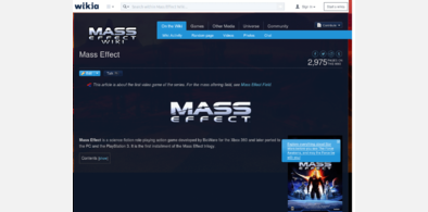
Tested to work for Mass Effect, Monster Hunter, Fallout and Witcher wikis.
I have tested that this works ONLY for viewing the wikis for now, all the other edits and fixes may come later.
This is my first userstyle ever, might have some weird bugs and
First install FreeStyler to use this style.
If you already installed it, please, make sure this site is allowed to run JavaScript.But you can download Freestyler for other browsers and apply styles there!
Applies to:
wikia.com