
Related styles:
-
 Created: Aug 31, 2010Last Updated: Sep 01, 2010
 -
 Created: Sep 14, 2010Last Updated: Jan 09, 2012
 -
 Created: Jun 11, 2012Last Updated: Jun 13, 2012
 -
 Created: Mar 06, 2014Last Updated: Mar 06, 2014
 -
 Created: May 10, 2012Last Updated: Jun 14, 2012
 -
 Created: Dec 10, 2014Last Updated: Dec 12, 2014
 -
Created: Jun 09, 2011Last Updated: Jun 10, 2011
-
 Created: Sep 17, 2009Last Updated: Sep 15, 2010

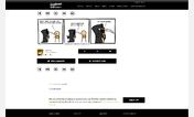
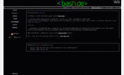
Evilmilk nice and clean
Description:
Optimised, and removed stuff.
More info
The page-navigator is on the left side, so you always can access the next/previous page.
The borders around the pictures are removed (they look weird imo).
If using Firefox, you can see when you are hovering an image (css3 animation).
Background black, and the primary color of the page can be chosen (default is green #00BB00)
Just the necessary stuff: the images, the title, (small) logo, and page navigator
Fixed the animation on hovering the thumbnails - replaced by a simple transition on click
search for
border-radius: 50px !important;
and remove it if you do not want to use it.
dec 2013: Aligned Heading (Title) to the Prev/Next Buttons
First install FreeStyler to use this style.
If you already installed it, please, make sure this site is allowed to run JavaScript.But you can download Freestyler for other browsers and apply styles there!
Applies to:
evilmilk.com