Related styles:
-
Salon.com Improved Large Print Edition
Installs:Created: Sep 08, 2012Last Updated: Sep 09, 2012 -
Created: Nov 21, 2015Last Updated: Apr 22, 2017
-
Created: Mar 21, 2013Last Updated: Nov 17, 2016
-
Created: Jun 24, 2013Last Updated: Nov 19, 2016
-
Created: Mar 13, 2013Last Updated: Dec 11, 2014
-
Created: Dec 26, 2016Last Updated: Feb 27, 2017
-
Created: Jun 29, 2013Last Updated: Jan 31, 2014
-
Created: Jan 24, 2017Last Updated: Mar 11, 2017
-
Created: Apr 15, 2015Last Updated: Sep 14, 2016


Feedly Large Print Edition (works with Readly)
Description:
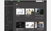
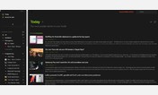
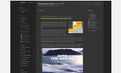
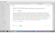
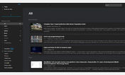
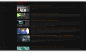
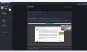
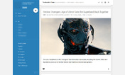
Google Reader* feed reader. However, my middle-aged eyes don't. The text size for entries and summaries is just too small, and the category labels are too low-contrast. I finally decided to do something about it.So here's a very simple user style to make Feedly as comfortable to read for myopic infofreaks as it is stylish. It should be easy to tweak for your own needs.
*Why you gotta break my heart Google man?
More info
If you're switching to Feedly from Google Reader, but miss the Google Reader layout, be sure to grab Lockal's http://userscripts.org/scripts/show/162237. It gives you a classic Google Reader layout, full width, high contrast, plus I can confirm that it works with Feedly Large Print Edition. While I still like my classic Feedly tiles and lists for most feeds, Lockal's script almost makes me want to switch to it full time. Seriously fantastic work.
September 6, 2012
Version 1.1
Changes: Increased font size of labels, feed titles, unread counts, and suggestions
August 10, 2012
Version 1.0
First install FreeStyler to use this style.
If you already installed it, please, make sure this site is allowed to run JavaScript.But you can download Freestyler for other browsers and apply styles there!
Applies to:
feedly.com