
Related styles:
-
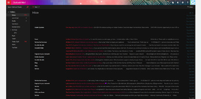
Outlook / Hotmail - DARK
Installs:Created: Jun 17, 2016Last Updated: Mar 27, 2017 -
 Created: Apr 19, 2016Last Updated: Mar 17, 2017
 -
 Created: Feb 18, 2009Last Updated: Nov 01, 2016
 -
 Created: Mar 08, 2013Last Updated: Feb 25, 2017
 -
 Created: Apr 23, 2016Last Updated: Nov 05, 2016
 -
 Created: Dec 12, 2016Last Updated: Apr 19, 2017
 -
 Created: Jun 28, 2014Last Updated: Sep 26, 2016
 -
 Created: Jul 05, 2016Last Updated: Sep 04, 2016
 -
 Created: Nov 01, 2013Last Updated: Sep 29, 2016

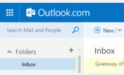
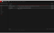
Trying to fix Hotmail Metro-Style Outlook.com
Description:
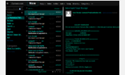
MS changed some IDs to classes. Changing style to compensate. Mostly affected the compose screen's awful "your screen is a tablet" side-by-side waste of space. Putting TO, FROM, SUBJECT back on top, where it belongs.
UPDATED MAY 17, 2013
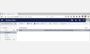
The new Outlook.com is awful on a monitor. Large, blocks of UI that have way too much padding and are positioned at the wrong spots. This is version 1 of trying to fix it, starting with the Compose screen. The "from/to/subject" are takes up half the screen, and is in the wrong place. Reduced font size, removed blockiness, put it back on top.
More info
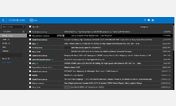
Version 2 - November 28, 2012 - Large right gutter suddenly appeared.
Version 3 - May 13, 2013 - Trying to give top icons more space to #BelowHeader
v4: Aug 27, 2014 - Made folders sidebar bigger to cover up the stupid messenger
v5: Nov 7, 2014 - Hotmail changed some IDs to classes, modified to accomidate
First install FreeStyler to use this style.
If you already installed it, please, make sure this site is allowed to run JavaScript.But you can download Freestyler for other browsers and apply styles there!
Applies to:
live.com