Related styles:
-
Extratorrent Dark with no ads.
Installs:Created: Dec 11, 2012Last Updated: Apr 06, 2014 -
Created: Sep 25, 2011Last Updated: Sep 26, 2011
-
Created: Sep 12, 2011Last Updated: Sep 13, 2011
-
Created: Dec 11, 2016Last Updated: Apr 25, 2017
-
Created: May 05, 2014Last Updated: Jul 23, 2014
-
Created: Mar 12, 2014Last Updated: Jul 23, 2014
-
Created: Jan 02, 2017Last Updated: Apr 10, 2017
-
Created: Nov 07, 2008Last Updated: May 28, 2015
-
Created: Feb 28, 2016Last Updated: Feb 29, 2016



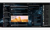
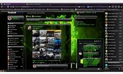
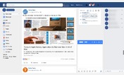
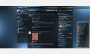
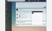

Dragosvr92@userstyles deleted this style because of "Facebook changed their layout and this is useless :-\"
Try Darker Facebook Redesigned instead of this deleted style.
See more styles for Facebook
Facebook:set like-comment buttons under the image.
Description:
More info
Initial release.
V2.0 (Apr 29, 2013)
Fixed the second like button, from the dark-popup photoviewer.
V3.0 (Sep 21, 2013)
Fixed "Tag photo" from the dark-popup photoviewer.
V4.0 (Jan 17, 2015)
Enlarged height from 21 to 26px due to fb enlarging their like and comment buttons.
First install FreeStyler to use this style.
If you already installed it, please, make sure this site is allowed to run JavaScript.But you can download Freestyler for other browsers and apply styles there!
Applies to:
facebook.com