Related styles:
-
Black Google Derivative
Installs:Created: Jun 03, 2013Last Updated: Nov 29, 2013 -
Created: Feb 28, 2014Last Updated: May 25, 2014
-
Created: Apr 29, 2013Last Updated: Apr 30, 2015
-
Created: Aug 04, 2013Last Updated: Feb 16, 2016
-
Created: Jan 29, 2013Last Updated: Feb 11, 2013
-
Created: Oct 16, 2013Last Updated: Dec 15, 2013
-
Created: Aug 04, 2013Last Updated: Oct 07, 2013
-
Created: Nov 22, 2013Last Updated: Dec 04, 2013
-
Created: Sep 26, 2012Last Updated: Sep 26, 2012



Upworthiest: usability & readability
Description:
More info
* fixes the new silly white floating nav-bar
2016-11-10
* update for blatantly white (.background--white) stuff. Hopefully they can stick to using this class on all retina-scorching elements.
2016-11-03
* update for new white .fluid-page class
2016-10-28
* remove survey iframe: I can't be bothered to style it and I don't see the point.
2016-10-27
* remove floating header (it's white and I don't see the point; it's just
trying to promote FB shares).
2016-06-30
* fix for white bar between story image and story
2016-05-03
* up the contrast on most text
2016-04-07
* updates for links with silly white shadow
* updates for white-backgrounded headers with borders passing through them from :before elements
* update to underp preview images of other stories
2016-03-22
* fixes for new white blocks in story pages
* clean up some page flow by removing some extraneous "subscribe here" elements. There are more than enough places to subscribe to Upworthy without the two I've removed, which were affecting page flow.
2016-01-26
* fixes for the latest round of "how much pain can I inflict on your retinas", a game played by Upworthiest web developers.
2016-01-15
* update for the new colors and layout which are part of the latest fantastic layout.
2015-08-03
* update for new topic bar at the top of the page
2015-03-16
* updates for white appearing in recommended link background
* tone down white in logo backgrounds
* tone down bordering colors
* re-align recommendation links
2014-10-22
* fix missing scrollbars for pages where Upworthy attempted to make you do their bidding
but this script saved you (:
20140909
* fix for adjusted h3 elements in info area.
20140904
* fix for white header items creeping in
* fix for white info blocks
20140829
* remove invasive advertising (leave in the more subtle "sponsored by")
- also removes the embedded Facebook pane. Embedding Facebook into
everything is the scourge of the internet. Right after people who
can't just "like" or "+1" a post, but have to also add "haha" so
you get an email notification about it.
20140828
* fix for arb white header stuff in wide view
* remove strange "sticky-header" which tries to bully you into sharing. Come on Upworthy. You're better than that.
20140821
* fix for white bordering in suggested next post
20140714
* update for the now invasive subscription and sharing elements. Of course, you can
always still share the old-fashioned way, by copying the url out of the address bar.
* update video container area to have more subtle bordering
20140511
* fix for sharing menu with glaring white backgrounds.
* fix for white blocks at the bottom of the page. Seriously, who styles divs, by ID, to have white backgrounds. Why not just leave the background alone?!
20140602
* prevent brain-dead "holler" overlay which pops it's little damaged head up when you
happen to move the mouse away from the content you want to see. Am I offending you,
Upworthiest devs? Good. Your invasive site hides excellent content through attempts
to push other crap at me. When I'm interested, I'll click the links to the right.
Now others can just enjoy the great content without being bullied into whatever agenda
you're currently pushing.
20140506
* update for promoted stories' background color
20140327
* better transcript area
20130218
* update to deal with transcripts
20131218
* fix for white email invitation area
20131204
* fixes for the "improved" site. Remove detracting garbage, simplify page, try to get
page to fit vertically to avoid scroll
20131018
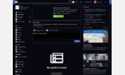
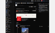
* got tired of the retina burning. Upworthy goes dark now too.
First install FreeStyler to use this style.
If you already installed it, please, make sure this site is allowed to run JavaScript.But you can download Freestyler for other browsers and apply styles there!
Applies to:
www.upworthy.com