Related styles:
-
Solarized Dark Everywhere
Installs:Created: Feb 16, 2014Last Updated: Nov 21, 2015 -
Created: May 12, 2014Last Updated: Apr 18, 2017
-
Created: Dec 03, 2016Last Updated: Apr 13, 2017
-
Created: Nov 07, 2013Last Updated: Sep 03, 2015
-
Created: Nov 19, 2015Last Updated: Nov 22, 2015
-
Created: Mar 17, 2014Last Updated: Mar 17, 2014
-
Created: Jun 22, 2014Last Updated: Mar 24, 2017
-
Created: Aug 10, 2015Last Updated: Aug 10, 2015
-
Created: Oct 11, 2015Last Updated: Jun 20, 2016



thedude@userstyles deleted this style because of "Hardly works anymore aside from the HTML only API; also DDG has a nice anon cookie-based CSS theme that they maintain with their UX changes. See their gear here:
https://duckduckgo.com/settings#appearance
Maybe it would be useful to start sharing cookie passphrases, like wookiefoot?
OR......."
Try Solarized Dark Everywhere instead of this deleted style.
See more styles for Duckduckgo
DuckDuckGo - Just Ducking Ducky
Description:
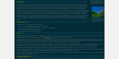
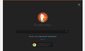
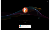
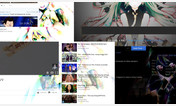
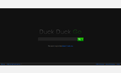
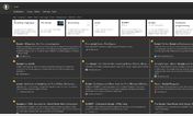
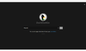
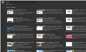
Leveled contrast with shades of grey. Deep Theming of DDG elements while still keeping most of the site's functions in tact. No calls made to external images, and a light CSS footprint.
Works on both html and java sites, and appears to work in both Firefox/Chrome (developed mostly in firefox.)
if you notice some theming conflicts just post below and I'll see what I can do.
Inspiration :Dark Duck Funeral
many internets to you, sir.
http://freestyler.ws/style/82445/duckduckgo-dark-duck-funerals
AOSP color schemes:
https://developer.android.com/guide/topics/ui/themes.html
Ethan Schoonover's Solarized Scheme
http://ethanschoonover.com/solarized
More info
Mashed together a styled replacement for the homepage logo and html results logo.
=2014-02-10=
mobile html background fix, desktop java search bar clear-x image fix
=2014-02-07=
Widescreen fixes, more paintbucketing, menu hover fix, css-hiding of ads. technically loads for their revenue, unseen by the user :)
possibly a userstyles toggle for flipping to full solarized theme soon.
==Oct 25==
fixed ad background in FFx, and made 'sponsored link' text more apparent. DDG deserves the money, they're not employing trackers, and the ads aren't terribly obtrusive. consider allowing them through ABE or whatever you may be using :-D
==July 7==
Fixed html-results sidebar overlapping in small-res/half-screen scenario
Fixed instant answer header link color legibility.
--
added adobe topcoat to previous/next buttons on html side http://topcoat.io/
dropped custom image for homepage logo. I like the Dax 'doodles'.
if you liked the simplistic style, drop this into the bottom of the stylesheet: http://pastebin.com/riWHPHaU
==July 5th==
patch for mobile browsers white bgcolor
==June 26==
created sprite of header background instead of making potentially identifying call to duckduckgo image
fixed a few oddities on the java side (zero click header, more menu button, some others i think)
fixed highlight color shade mismatch
==June 25th==
Fixed:
white bottom bar on java site (main site)
hover highlight of results on java site
filled sidebar elements
menu options
paintbucketed the feedback page. meh.
reintroduced hover fading
optimized CSS
First install FreeStyler to use this style.
If you already installed it, please, make sure this site is allowed to run JavaScript.But you can download Freestyler for other browsers and apply styles there!
Applies to:
duckduckgo.com