
Related styles:
-
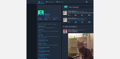
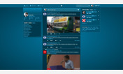
Twitter Dark Mode (2017)
Installs:Created: Nov 18, 2016Last Updated: Apr 23, 2017 -
 Created: Jan 31, 2014Last Updated: Mar 28, 2017
 -
 Created: Nov 21, 2014Last Updated: Jan 24, 2017
 -
 Created: May 11, 2015Last Updated: Jan 04, 2016
 -
 Created: Aug 28, 2015Last Updated: Mar 01, 2016
 -
 Created: Sep 13, 2016Last Updated: Apr 11, 2017
 -
 Created: Oct 02, 2015Last Updated: Mar 01, 2016
 -
 Created: Oct 08, 2014Last Updated: Oct 08, 2014
 -
 Created: Nov 25, 2016Last Updated: Apr 11, 2017

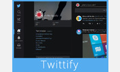
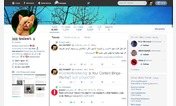
Better Twitter
Description:
First install FreeStyler to use this style.
If you already installed it, please, make sure this site is allowed to run JavaScript.But you can download Freestyler for other browsers and apply styles there!
Applies to:
twitter.com