Related styles:
-
Habr Geektimes dark
Installs:Created: May 19, 2014Last Updated: Apr 12, 2017 -
Created: Nov 21, 2015Last Updated: Apr 22, 2017
-
Created: Mar 21, 2013Last Updated: Nov 17, 2016
-
Created: Jun 24, 2013Last Updated: Nov 19, 2016
-
Created: Mar 13, 2013Last Updated: Dec 11, 2014
-
Created: Jun 29, 2013Last Updated: Jan 31, 2014
-
Created: Dec 26, 2016Last Updated: Feb 27, 2017
-
Created: Jan 24, 2017Last Updated: Mar 11, 2017
-
Created: Apr 15, 2015Last Updated: Sep 14, 2016



spmbt4@userstyles deleted this style because of "double"
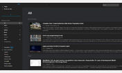
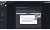
Try The Dark and Flat - Feedly instead of this deleted style.
See more styles for Feedly
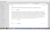
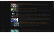
feedly.com more compact (double)
Description:
The better solution is CSS+JS in https://greasyfork.org/en/scripts/5915-feedly-partial-refresh-by-r-in-any-keyboard-layout
More info
2014-11-29: "https" url prefix
2014-07-22: 17px title size
2014-07-02 __Userscripts__ feedlyCtrlF5 are added in https://github.com/spmbt/haPages/blob/gh-pages/feedlyctrlf5.user.js (install by raw link https://raw.githubusercontent.com/spmbt/haPages/gh-pages/userscript/feedlyCtrlF5/feedlyctrlf5.user.js ).
2014-05-09: more little margins in "Title only" style of feeds
In the site feedly.com there are many keyboard shortcuts, for example, "R" - is "Refresh" of part of page, renewing of list of records. Unfortunately, there is bug in any national keyboard layout. It catch keyboard letter, but not key code. Script fix it and add such partial refresh by Ctrl-F5 or Shift-F5.
Userstyles are added to script as bonus. Styles make table more compact and remove unneeded buttons such as Twitter etc. It may to disable userstyles by CSS_ON =0.
First install FreeStyler to use this style.
If you already installed it, please, make sure this site is allowed to run JavaScript.But you can download Freestyler for other browsers and apply styles there!
Applies to:
feedly.com, https://feedly.com