Related styles:
-
Feedly: Grid View (Mosaic)
Installs:Created: Apr 01, 2013Last Updated: Nov 16, 2014 -
Created: Sep 29, 2014Last Updated: Sep 30, 2014
-
Created: Jul 27, 2015Last Updated: Jul 27, 2015
-
Created: Oct 06, 2012Last Updated: Apr 02, 2013
-
Created: Nov 21, 2015Last Updated: Apr 22, 2017
-
Created: Mar 21, 2013Last Updated: Nov 17, 2016
-
Created: Jun 24, 2013Last Updated: Nov 19, 2016
-
Created: Mar 13, 2013Last Updated: Dec 11, 2014
-
Created: Jun 29, 2013Last Updated: Jan 31, 2014


Feedly: Grid View (Mosaic) [Responsive]
Description:
Changelog: http://michaeltunnell.com/feedly-mosaic-userstyle-changelog
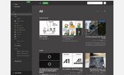
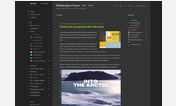
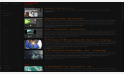
Feedly decided to kill the "Mosaic" (Grid) view from v14. This style resurrects the Mosaic view by replacing the Card view.
"Mosaic" was my preferred view when I wanted to display items that contained pictures because it provided a nice display with a grid layout of items while at the same time not wasting any space with clutter. Cards on the other hand wastes a ton of space and is mostly clutter. I decided to revive Mosaic and make it a happy medium between Google Reader's minimalism and heavy visual apps like Flipboard or Feedly (now).
Default Views & Item Counts
Cards = 6
Magazine = 5
Timeline = 5
Grid View (Mosaic) = 12+
Mosaic Responsive = 20+
Non-responsive version = http://freestyler.ws/style/80556/feedly-grid-view-mosaic
More info
Released: November 16th, 2014
Author: Michael Tunnell (http://michaeltunnell.com) || (http://visuex.com)
RSS Feed: http://michaeltunnell.com/feeds/feedly-mosaic-userstyle
Changelog: http://michaeltunnell.com/feedly-mosaic-userstyle-changelog
First install FreeStyler to use this style.
If you already installed it, please, make sure this site is allowed to run JavaScript.But you can download Freestyler for other browsers and apply styles there!
Applies to:
feedly.com