Related styles:
-
DuckDuckGo - Duck Custom
Installs:Created: Aug 10, 2015Last Updated: Aug 10, 2015 -
Created: May 15, 2015Last Updated: Nov 12, 2015
-
Created: Aug 23, 2015Last Updated: Dec 02, 2015
-
Created: Mar 06, 2010Last Updated: Mar 07, 2010


movielens.org remix
Description:
More info
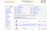
The release of movielens.org version 4.2.1 build 2015.8.28.1018 incorporated a fixed header toolbar with a new format. It also has a different presentation for the images and clips from the movies. There were other minor changes done to the website. GroupLens Research acted on the feedback they received and that is to be applauded.
I changed a little bit the new header bar and corrected all important problems I found related to it. I also fixed a problem where alerts would not be shown but instead simply hide the header toolbar away! That was because of some unwise tricks in my style.
This style has corrections to the projector of clips and stills from the movies. These are shown now using the full browser window. The stills background will be a dark gray shade instead of black stripes when the stills do not cover the full window (letterbox). However the black stripes will be used for clips in letterbox format. This style sets the previous/next buttons used with the stills to what they were in the past (encircled arrows). The style moves them a bit farther to the sides. It also re-positions the close x to the lower right corner, instead of the top right. The borders for these buttons are set as before the change in movielens.org. The style has corrections to fit the projector in the screen properly and remove some annoying scroll-bars.
Old:
- I fixed any bugs I found: In my original version the header was hiding notifications (alerts) in the profile page.
- I reverted a change where focused posters were faded showing info; now the just show a dashed outline.
- Now you can select a movie by pressing anywhere in the movie poster area, even if the poster is missing!
- The search submit button has a new style: it has a different color and it will literally say "submit".
- Overly long titles in the search suggestions will wrap around instead of overflowing out of the search suggestions panel.
- The "Sort by" button drop down menu will be right aligned and will stretch to the left so that it does not flow out of the window.
- The projector for viewing images and trailers from the movies has now a different background, a dark shade instead of black frame. It will take the area that is 90% hoziontal and 90% vertical of the window, centered horizontally but with only 2.5% from the top (7.5% from the bottom). The close button has been replaced with a large "X" on the bottom right of the window.
- The menus from the header for the genres and the account (explore and username) are a bit tighter. The look of the dialog from the number of ratings for picking the recomender and "your movies" is a little different.
- The blue warning box now has a shade.
- Your feedback is welcome ツ
P.S. This was developed and tested with a 1366×768 screen resolution. I am not sure how it works on any other screen size.First install FreeStyler to use this style.
If you already installed it, please, make sure this site is allowed to run JavaScript.But you can download Freestyler for other browsers and apply styles there!
Applies to:
movielens.org