Related styles:
-
DuckDuckGo - Duck Custom
Installs:Created: Aug 10, 2015Last Updated: Aug 10, 2015 -
Created: Aug 23, 2015Last Updated: Dec 02, 2015
-
Created: Feb 26, 2015Last Updated: Apr 20, 2017
-
Created: May 12, 2014Last Updated: Apr 18, 2017
-
Created: Dec 03, 2016Last Updated: Apr 13, 2017
-
Created: Nov 07, 2013Last Updated: Sep 03, 2015
-
Created: Nov 19, 2015Last Updated: Nov 22, 2015
-
Created: Mar 17, 2014Last Updated: Mar 17, 2014
-
Created: Jun 22, 2014Last Updated: Mar 24, 2017




DuckDuckGo - Multi-Columns Custom
Description:
More info
Warning for the "Fix titles on narrow view" option.
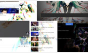
When using the default (black/gray over white) theme for DuckDuckGo, if the viewport/window is 634 pixels or less wide, the titles for visited results are colored gray instead of black. The fix titles on narrow view option sets these titles back to the default dark color. However this fix makes the titles have the same color as the background if using DuckDuckGo's dark theme. This fix is intended only for the default theme and will probably have a negative effect when using a dark background. (This option is active in the primary screenshot!)
Details
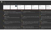
There are many options to customize this style as you like:
- The region switch may be replaced by a ballot box (style default).
- The number of columns may be fixed to 2, 3, or 4, or let it self-adjust 1-4.
- The highlighted result will optionally (by default) have a shaded margin.
- Optional result numbers (default) can be displayed with various color settings.
- The mark for visited results can be changed (or omitted).
- The search keys will may have an optional color as highlight on the result summary text.
With this style, the bar on the top of the page will scroll out of the browser window.The colors in most screenshots are from DuckDuckGo's settings. They can be achieved with URL parameters (see https://duckduckgo.com/params). For the different images shown the setting used are:
- https://duckduckgo.com/?kae=-1 (or no parameter at all)
- https://duckduckgo.com/?kae=d
- https://duckduckgo.com/?kae=#fbe1e1&ky=#Fbcccc
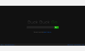
- https://duckduckgo.com/?kae=#111111&ky=#181818
The last screenshot is combined with http://freestyler.ws/style/89803/duckduckgo-dark by Thermalzombie@userstyles (it is best to hide the visited result mark for this combination).The regions in the screenshots are United States, Latin America (Off), No Region Selected, China, and France. The first screenshot was rendered with Dragon (a Chrome variant), all other screenshots were rendered with Firefox.
Changes/Corrections
...on 2015-Nov-12:
- The Firefox extension SearchPreview was preventing multiple columns. The code clears the style setting from that extension so it can do its job. Credit: I learn the correction from the style http://freestyler.ws/style/129206/ddg-simple-3-columns by rayman88@userstyles.
...on 2015-Aug-05:- I added support for Auto-Load so results are added automatically as you scroll to the bottom of the page. This default option can be disabled through DuckDuckGo's https://duckduckgo.com/settings. However, loading more results will happen automatically if the scrollbar is used to reach the bottom of the page regardless of the setting.
- The space between rows is now a bit smaller. The space between columns is fixed to be equal to the space between rows. However if the window is 635 pixels wide or norrower, there will be no space between columns.
- If the number of columns is self-adjusting (1-4), when the window width is 634 pixels or less, the results are presented in a single column since the previous update. Now, this column has no extra space to the right. The rows/boxes in this column are separated by a much smaller space and their height will adjust to fit the snippet quoted in the result. The extra space in the box is now trimmed so the style is convenient even on a narrow window. The result titles remain cropped to fit in a single line.
...on 2015-Jul-07:I added this following decembre@userstyles's update in http://freestyler.ws/style/97214/duckduckgo-multi-columns-v-6. Thanks to https://forum.userstyles.org/profile/11333/Barbiegirl for pointing out the problem in the earlier version of DuckDuckGo - Multi-Columns. The update uses a strategy that was already in http://freestyler.ws/style/77394/morecolumns by ogr@userstyles but a bit more cleverly. Although I am sure Decembre did not copy from ogr, I looked into ogr's solution first, henceforth this update limits the license to http://creativecommons.org/licenses/by-nc-sa/4.0/
- A new option and default lets the style choose the number of columns to match the browser's window width. This will prevent the result tiles form been too narrow when you shrink your browser's window.
- The ballot box with check mark for the region switch will was fixed to work properly with the http://freestyler.ws/style/107489/beautiful-dark-duckduckgo style.
- In the spirit of the style http://freestyler.ws/style/105352/duckduckgo-dark-tile-fix the result tile borders is now softer for a better look especially for dark themes.
- I found it was possible for the mark for visited results not to be colored properly (or not be displayed when it should) when using Chrome. This bug should was just fixed.
...on 2015-Jun-09:- The option for not showing the mark for visited results will work properly.
- The ballot box with check mark for the region switch will transition properly in Chrome.
- The corners of the highlighted result shall be straight like for the rest of the results.
- I am aware the circles for the result numbers are not perfect, but that is how it works best for showing the numbers in them without making them bigger.
...on 2015-Jun-04:- I added code that corrects a problem regarding big screen displays. I found it is possible the results were not filling the viewport/window width. I do not have a big monitor so I do not really know if this was a problem before for anyone. If in the Appearance tab of DuckDuckGo's Advanced Settings the Page Width was set to Wide or Super Wide, the problem was evident.
...on 2015-Jun-02:With this change the About and Definition that may show above the results can use a wider area of the display.(The primary screenshot has not been updated yet).
- I added the option to fix titles on narrow view.
...on 2015-May-28:This change fixes a problem where the marks were not showing when the window was too narrow
First install FreeStyler to use this style.
If you already installed it, please, make sure this site is allowed to run JavaScript.But you can download Freestyler for other browsers and apply styles there!
Applies to:
duckduckgo.com