
Related styles:
-
NeoGAF Pro Dark
Installs:Created: Nov 11, 2011Last Updated: Jul 29, 2013 -
 Created: Jun 21, 2013Last Updated: Sep 11, 2015
 -
 Created: Sep 23, 2015Last Updated: Sep 23, 2015
 -
 Created: Nov 04, 2008Last Updated: Mar 18, 2010
 -
 Created: Dec 19, 2008Last Updated: Mar 30, 2012
 -
 Created: Sep 04, 2012Last Updated: Sep 04, 2012
 -
 Created: Feb 01, 2011Last Updated: Feb 01, 2011
 -
 Created: Jan 20, 2015Last Updated: Jan 20, 2015
 -
 Created: Jun 21, 2013Last Updated: Jun 22, 2013

NeoGAF Better Typography
Description:
First install FreeStyler to use this style.
If you already installed it, please, make sure this site is allowed to run JavaScript.But you can download Freestyler for other browsers and apply styles there!
Applies to:
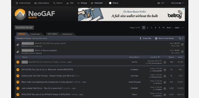
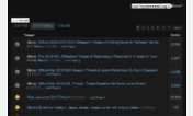
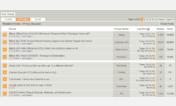
neogaf.com