Related styles:
-
NeoGAF Gold - Membership Required
Installs:Created: Jun 21, 2013Last Updated: Jun 22, 2013 -
Created: Nov 11, 2011Last Updated: Jul 29, 2013
-
Created: Sep 23, 2015Last Updated: Sep 23, 2015
-
Created: Nov 04, 2008Last Updated: Mar 18, 2010
-
Created: Jun 02, 2015Last Updated: Jun 02, 2015
-
Created: Dec 19, 2008Last Updated: Mar 30, 2012
-
Created: Sep 04, 2012Last Updated: Sep 04, 2012
-
Created: Jan 20, 2015Last Updated: Jan 20, 2015
-
Created: Feb 01, 2011Last Updated: Feb 01, 2011

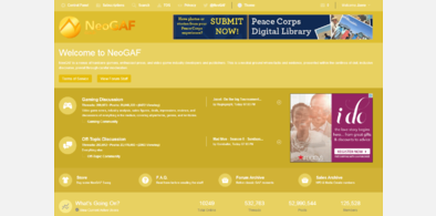
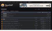
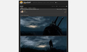
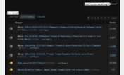
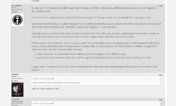
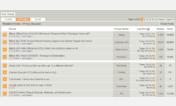
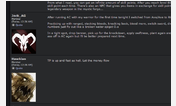
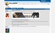

NeoGAF Dark Gray
Description:
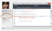
*User highlighter is orange by default. Put your username in the first line of the code.
[data-username="PUT YOUR USERNAME HERE"]
More info
Edited the header color to something darker
Version 2.1
*Fixed the visited link being too bright.
Version 2.1
*You can now choose a color for user highlighter (orange by default)
Version 2.0
*Changed button colors for quick reply tool.
Version 1.9
*Fixes buttons that were broken with the quickreply tool
*Changed code quote color
*Made some buttons dark
Version 1.8
*Tabs should work with the neogaf.fixed extension, i also incorporated some things from it.
Version 1.7
* Made the tab postitions closer together like Mr. Bigs theme
Version 1.6
* Lightened user post since it was a little too dark.
* Removed tabs hiding on the right side of the page.
Version 1.5
* Made the colors compatible with Hate Radio's Quick Quote script.
Version 1.4
*Fixed .thead color
Version 1.3
* Made it work with the official dark theme
* Darkened own post for people who can't see well :P
Version 1.2
* Changed header color
Version 1.1
* Changed the toolbar color to a lighter shade.
First install FreeStyler to use this style.
If you already installed it, please, make sure this site is allowed to run JavaScript.But you can download Freestyler for other browsers and apply styles there!
Applies to:
neogaf.com