Related styles:
-
Youtube Hide Next Button
Installs:Created: Mar 31, 2016Last Updated: Mar 31, 2016 -
Created: Feb 26, 2017Last Updated: Feb 26, 2017
-
Created: Apr 12, 2017Last Updated: Apr 12, 2017
-
Created: Oct 30, 2015Last Updated: Oct 01, 2016
-
Created: Jan 18, 2016Last Updated: Jan 18, 2016
-
Created: Jan 18, 2016Last Updated: Jan 18, 2016
-
Created: Feb 07, 2016Last Updated: Jul 02, 2016
-
Created: Oct 30, 2016Last Updated: Oct 30, 2016
-
Created: Jul 23, 2016Last Updated: Apr 14, 2017


jimbo1qaz@userstyles deleted this style because of "Broken until further notice."
Try Youtube Hide Next Button instead of this deleted style.
See more styles for Youtube
Youtube Fullscreen Buttons 2015
Description:
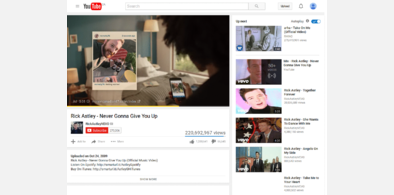
Removes the annoying gap between fullscreen buttons and the corners of the monitor.
The gap was added during the 2015 Youtube HTML5 player redesign.
Note that this style currently breaks the alignment and animation of the seek bar. I'm still trying to fix that.
More info
1.1: Added progress bar color tweak from wareya (http://pastebin.com/JLQwFSh7).
First install FreeStyler to use this style.
If you already installed it, please, make sure this site is allowed to run JavaScript.But you can download Freestyler for other browsers and apply styles there!
Applies to:
youtube.com