Related styles:
-
Created: Dec 03, 2015Last Updated: Nov 06, 2016
-
Created: Mar 10, 2017Last Updated: Mar 10, 2017
-
Created: Dec 10, 2015Last Updated: Apr 01, 2017
-
Created: Nov 20, 2016Last Updated: Feb 03, 2017
-
Created: Dec 17, 2016Last Updated: Jan 07, 2017
-
Created: Feb 29, 2016Last Updated: May 11, 2016
-
Created: Mar 01, 2017Last Updated: Mar 01, 2017
-
Created: Nov 19, 2016Last Updated: Feb 03, 2017
-
Created: Apr 18, 2015Last Updated: Apr 22, 2015

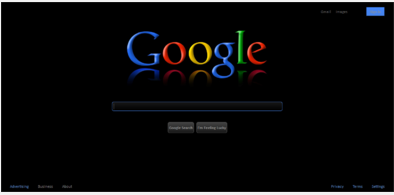



Black Google by Panos - R. Schneider Mod (Medium)
Description:
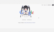
FIXED: Panos' style and other derivatives of it have progressive De-Centering of their Google logo with page-zoom change / a large gray box around the search query box / and a white footer-bar on the Search Results page. ALL 3 are fixed in my userstyle. Also, Google logo is larger, more vibrant-colored, with better highlights and 3D effect (Panos' is "washed out"). Detailed "Comments" section at top of CSS demarcates Panos' code from mine, and tutorial shows users how to use their own logo. I also credit Panos for his generally excellent work in my CSS "Comments". I also have a Google favicon mod (a Greasemonkey user script):
"Revert to Google's Old 2012-2015 Favicon"
(reverts to the "white lower-case 'g' in a blue square" favicon)...
https://greasyfork.org/en/scripts/12271-revert-to-google-s-old-2012-2015-favicon
More info
2016 Oct 28 - UPDATE REQUIRED !! The Google Logos my 2 Userstyles use were unreachable on the internet, so my Userstyles lost my logos, through no fault of mine or the userstyles. I then uploaded my 2 Google logos (for both my Large and Medium Black Google userstyles) to another image hosting service, and edited my userstyles to point to the new logo image hosting URLs on Imgur.com. My 2 Google userstyles were restored, and need manual updating on computers that don't have their Stylish userstyles set to auto-update. The image hosting service I had used for my Google logos, Postimage.org (founded in 2004), was taken offline by their Content Delivery Network provider, CloudFlare - which made the logo portion of my userstyle unreachable (resulting in a totally black area above Google's search query box). That's right, CloudFront shut down Postimage.org's image hosting server access, making nearly 140 million images hosted by Postimage, and embedded into some 450 thousand websites, totally unreachable - due to Postimage exceeding CloudFlare's bandwidth useage limits - even though CloudFlare clearly states, on their Support page, "CloudFlare does not have bandwidth limits ..." Postimage.org's images remained offline for 2 days. Postimage.org posted pleas on their homepage for help to stay alive in the form of donations and CDN services, and 9 days after the problem started, on Nov 5, Postimage.org posted thanks for help received, from both individual users and server and CDN companies. (I uploaded Postimage.org's NOTICE about the problem, and their UPDATE regarding help received, in a PasteBin posting of mine for those interested, at http://pastebin.com/0Dp510C2). [NOTE: CloudFlare.com should not be confused with another CDN with a similar name, Cloudfront.net.]
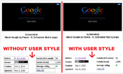
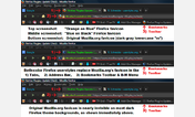
2016 Mar 07 - THIS UPDATE FIXES Panos code's large gray rectangle surrounding the search box and buttons (also having a thin, off-center black border immediately around the search box), by changing that rectangle from gray to black (therefore eliminating the rectangle), for a uniform black background across the entire screen. (See my 3rd screenshot - linked under my Main screenshot - showing the ACTUAL "Black Google by Panos" style's gray rectangle - its specific gray color IS SPECIFIED in Panos' code. The screenshot Panos has posted for the current style is not currently accurate, and has been false for well over a year; that gray rectangle has been there, but Panos doesn't show it in his screenshot. An old screenshot was probably left in place instead of being updated, but that falsely represents his style's appearance. I finally got fed up with it and eliminated it with this update for a much cleaner appearance). ALSO, a temporary fix for horizontally centering the search box itself on the screen (it's not centered perfectly even on Google's page unmodified, i.e. with User Styles disabled) - this is NOT a Panos code issue, it is a Google code issue that was not dealt with by Panos. The code change I made centers the search box for my screen resolution. A fix for 'responsive design' (with 'fluid width') for all screen resolutions, to perfectly center the search box for all resolutions AND screen magnifications requires further CSS changes which I'm too busy to address now, probably requiring addressing a Child-Element centering within Parent-Element issue. (See the secondary screenshot, linked below the main screenshot), comparing the center details of Panos' style with this one). [NOTE: After installing this user style, if the search box isn't horizontally centered on your screen, you can modify a CSS setting to adjust it on your screen as follows: Firefox Menu "Bookmarks" (or Alt+F "Bookmarks" > "Add-Ons Manager" > "User Styles" > click "Edit" for this Style > in the User Style Editor that opens, scroll down to find line "#sb_ifc0" (approximately line 414) > THEN, on the NEXT line modify the "width" value - change it from "556px" to a lower number of pixels to move search box centering leftward, or a higher number of pixels to move search box centering rightward. THEN CLICK "SAVE" near the upper left. Changes are applied to Google's homepage immediately, if this user style is Enabled. This workaround for my temporary fix will be not be necessary after I implement the permanent fix. (The pixel change instructions are summarized in a Comment Block in the CSS code right above the "#sb_ifc0" line).]
2015 Dec 06 - THIS UPDATE FIXES Panos' style issue of Logo Horizontal Centering, as well as the De-Centering that occurs with changes in page zoom magnification. (Centering with this style is absolutely perfect, regardless of page zoom - more details in "Comments" section at top of CSS code). This style's Google Logo size is 38% wider than my Medium Logo style, and 69% wider than Panos' small logo.
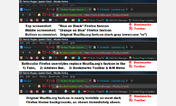
If you're like me, and sometimes feel my Large Google Logo version is too bombastic, or my Medium Google Logo version is too demure - install both styles, then simply switch between the 2 at a whim... Click the "S"-in-blue-square' Stylish icon (by default at the lower-left of screen in Add-On Bar/Status Bar, but can be customized into any Firefox toolbar), then click the style(s) to enable or disable. (If one or more user style for a website is installed, but disabled, the Stylish icon is differently colored - "S"-in-gray-square"). In less than 5 seconds you can switch between styles, if more than one is installed per site. No need to enable/disable via Firefox Add-Ons Manager, you do it on any webpage having styles installed, via the Stylish icon. (For example, I have 2 styles from different authors installed for Wikipedia.org, with both enabled - unless I want to save the Wikipedia webpage, then I quickly disable both via the Stylish icon).
Panos Licensed his work in the Public Domain (Creative Commons CC0, aka Creative Commons "Zero"), not even requiring attribution. (That means anyone could copy his work and redistribute it, EVEN UNDER A NEW NAME, without ANY attribution). But I fully attribute his fantastic work, and demarcate his style's code from my modifications in a very detailed "COMMENTS" section at the top of the User Style. My derivative style is Licensed as Creative Commons CC BY-NC, allowing free use, modification, and distribution (but only Non-Commercially) - BUT requiring attribution for all authors - from now on Panos will be assured attribution through my style's License terms. (License Terms are at: http://creativecommons.org/licenses/by-nc/4.0/)
First install FreeStyler to use this style.
If you already installed it, please, make sure this site is allowed to run JavaScript.But you can download Freestyler for other browsers and apply styles there!
Applies to:
http://www.google, https://www.google, https://images.google, http://news.google... More »