Related styles:
-
Created: Jan 28, 2016Last Updated: Jan 28, 2016
-
Created: Aug 31, 2015Last Updated: Aug 31, 2015
-
Created: Sep 01, 2015Last Updated: Sep 10, 2015
-
Created: Aug 29, 2015Last Updated: Aug 26, 2016
-
Created: Sep 01, 2015Last Updated: Sep 01, 2015
-
Created: Dec 18, 2012Last Updated: Sep 01, 2015
-
Created: Dec 18, 2012Last Updated: Aug 29, 2015
-
Created: Aug 31, 2015Last Updated: Aug 31, 2015
-
Created: Dec 17, 2012Last Updated: Sep 01, 2015

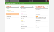
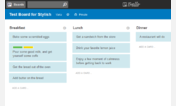
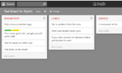

WorkFlowy: light theme
Description:
More info
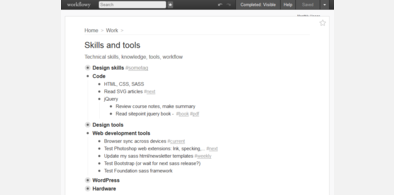
- top level items of current view are bold (like main titles)
- note styles: serif font (Lora or a default serif font), more bottom margin
- no tag underlines
- saved (starred) pages appear on the left instead of at the bottom
If you ONLY need the bold titles (for top level view), I have made http://freestyler.ws/style/134327/workflowy-bold-top-level-items-like-headings for that.
*Changes*
- 2016 01 30: moved starred pages to the left instead of at the bottom, for better readability, and closer to star button.
- 2016 01 21: changed body back to white for workflowy blog, inverse italics in notes when italicised, top level items a bit smaller, tags in top level items not bold
First install FreeStyler to use this style.
If you already installed it, please, make sure this site is allowed to run JavaScript.But you can download Freestyler for other browsers and apply styles there!
Applies to:
workflowy.com