Related styles:
-
Created: Dec 03, 2015Last Updated: Nov 06, 2016
-
Created: Mar 10, 2017Last Updated: Mar 10, 2017
-
Created: Dec 04, 2015Last Updated: Nov 06, 2016
-
Created: Dec 10, 2015Last Updated: Apr 01, 2017
-
Created: Nov 20, 2016Last Updated: Feb 03, 2017
-
Created: Feb 29, 2016Last Updated: May 11, 2016
-
Created: Nov 19, 2016Last Updated: Feb 03, 2017
-
Created: Mar 01, 2017Last Updated: Mar 01, 2017
-
Created: Jun 27, 2009Last Updated: Jun 28, 2009



TitanTV - Cleaner & Darker (by R. Schneider)
Description:
More info
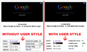
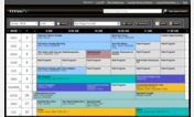
NOTE: The header area shown in my screenshots shows the affect of "cosmetic element" hiding made with the "uBlock Origin" Firefox ad blocking add-on. (The "Adblock Plus" add-on offers similar capabilities). Several header links, including lineup editing links are hidden for a cleaner header area. Those elements can be one-click unhidden with "uBlock Origin" (or "Adblock Plus") if they are needed. If userstyles.org allowed more than 6 screenshots of their user styles, I would have included a screenshot with the header elements unhidden. If user feedback indicates a preference for a replacement "Style Applied Screenshot" showing the elements unhidden, I'll replace my screenshot accordingly.
Both my user style and the one it supersedes incorporate the excellent code of "Valacar's Dark Gradient Theme" (which adds greatly to the userstyle-modified webpage's appearance). See http://freestyler.ws/style/14353/titantv-clean-wide-dark for r3t3ch's credits regarding prior work he adapted (including a "chrisdillon" user style). The "r3t3ch" user style was licensed as "Public Domain".
First install FreeStyler to use this style.
If you already installed it, please, make sure this site is allowed to run JavaScript.But you can download Freestyler for other browsers and apply styles there!
Applies to:
titantv.com