Related styles:
-
Better Twitter V4
Installs:Created: May 09, 2012Last Updated: Jun 07, 2012 -
Created: May 14, 2012Last Updated: May 16, 2012
-
Created: May 03, 2012Last Updated: May 15, 2012
-
Created: May 05, 2012Last Updated: May 19, 2012
-
Created: Nov 18, 2016Last Updated: Apr 23, 2017
-
Created: Jan 31, 2014Last Updated: Mar 28, 2017
-
Created: Nov 21, 2014Last Updated: Jan 24, 2017
-
Created: May 11, 2015Last Updated: Jan 04, 2016
-
Created: Aug 28, 2015Last Updated: Mar 01, 2016

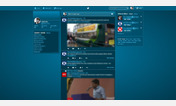

Description:
Default options are the same as the Better Twitter V4.
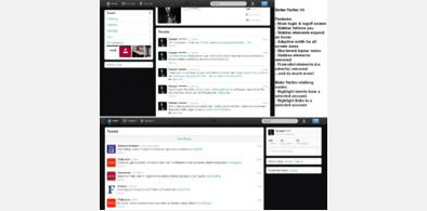
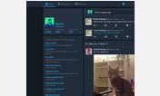
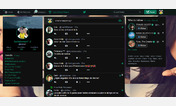
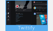
Some features:
—Login & logoff screen
—Sidebar stays fixed
—Left or right sidebar
—Sidebar elements collapse
—Adaptive width*
—Shortened dropdown menu
—Useless elements removed
—Adverts removed
—Smaller profile card
—Close all tweets button is now illuminated logo
—Last new Tweet is emphasised
—Enlarge profile pics on hover
—Always use your background
…& more! (see More Info)
*may need optimisation for large/small windows
Make Twitter-stalking easier:
—Highlight tweets from a selected account
—Highlight links to a selected account
Versions:
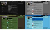
—Original - Stays at the default width
—Adaptive Width
—Left-focused Adaptive Width - Sidebar on right
Read More Info, http://www.userstyles.org<a href=">browse my other styles, & enjoy!
More info
7/6/12 Bugs
— Twitter's new logo changed the topbar icon. It used to illuminate instead of the close all tweets button, and you click it to close all tweets. Now you must click to the right of it (the hand cursor makes this clear). I don't have time to figure out how to fix this, and won't anytime soon,, so please be in touch if you know how.
— Profile picture enlargement is not always right as it is dependent on the scale of the original picture
Updates
7/6/12 Update; V4.1.5
— Twitter changed their logo; code is updated accordingly
— Added options to use old logo (Requires three instances of the option)
— Made highlighted topbar icon instead of close all tweets button an option due to bugs [See: Bugs]
24/5/12 Update; V4.1.4
— Minor fixes
23/5/12 Update; V4.1.3
— Improved translucency options
— Minor edits
22/5/12 Update; V4.1.2
— Added translucent main content and sidebar to improve visibility of background
21/5/12 Update; V4.1.1
— Added emphasis on usernames instead of full names
— Minor edits
20/5/12 Update; V4.1.0
— Improved profile picture enlargement
18/5/12 Update; V4.0.9
— Added option to remove Twitter stats due to http://www.darrenbarefoot.com/archives/2009/03/the-tyranny-of-twitter-stats.html
— Added more options for customising the topbar
— Improved background options
17/5/12 Update; V4.0.8
— Consistent background option - Fixed (required "!important" to be added)
16/5/12 Update; V4.0.7
— Added enlargement of profile pictures on hover
— Added consistent background option
READ BEFORE INSTALLING
Our Name
Our name was inspired by Matt Kruse's Better Facebook (now called Social Fixer); we intend to make a similar add-on, but for Twitter. Only after the third version of our Better Twitter did we discover PayamR - Better Twitter; we have used none of their code and are in no way affiliated.
What is this?
This is many user styles in one, and so much more! This is a taster of the soon-to-be-released Firefox add-on. We hope to have that ready for you by September 2012. CSS has it's limitations, so expect much more from the add-on!
Support
Countless hours have been spent creating and improving Better Twitter, to optimise your Twitter experience for free. The ads on this website are not by us, but by the owner of the site, and we make no money for them. We have spent hours creating this, released it totally open source, and haven't asked you for donations or anything like that; we believe that the best things in life are free. (Although, if you really want, you can donate from the PayPal link at the bottom of page, in the Feedback section.) All we ask is that, if you like this style, please tell your friends and share it on Facebook and Twitter. The more people we know we're benefiting, the more we will work to create something great. It also means that there will be more feedback to create a better product for you. So please, we aren't asking for much, just share a link to this if you like it. Sharing is caring.
Versions
This, Version 4, should be our last main release before the add-on. We decided to provide this 'with Options' version to give you more choice, but the default settings are the same as the Better Twitter V4. We have released all four versions in the space of as many days, but rest assured that this is the final one (unless a major problem is noticed), so you shouldn't need to keep checking for updates. But do stop by every once in a while to see our latest styles!
Version 4 has three sub-versions: Original, Adaptive Width, and Left-focused Adaptive Width for you to choose from.
Full Features List:
• Version choice, allowing adaptive width for all screen sizes* and a choice of the sidebar on the left or right:
—Original – Stays at default width
—Adaptive Width - Sidebar on left (like normal) and the width is adaptive
—Left-focused Adaptive Width - Sidebar on right (like normal) and the width is adaptive
• Clean login screen, removing unnecessary elements, sign-up elements, and making it look nice
• Clean logout screen, removing mobile downloads adverts and making it look nice
• Remove promotions/adverts throughout Twitter
• White translucent background box is removed**
• Highlight tweets from a specified account, and links to a specified account
• The sidebar scrolls down the page with you**
• The profile card on account pages is smaller, allowing the sidebar to start at the top of the page**
• Expand/Collapse extra sidebar elements on hover, so they take less space and aren’t distracting
• Remove the sidebar footer as it is of no use
• Switch sides of top bar elements; this may be something you particularly want of you are using the left-focused version
• The ‘Close all Tweets’ button now illuminates the black logo on the topbar; click that to close all Tweets**
• Remove top bar icons
• Remove @Connect, #Discover, and/or the Compose New Tweet button from the topbar
• Remove Twitter stats (See http://www.darrenbarefoot.com/archives/2009/03/the-tyranny-of-twitter-stats.html argument for it.)
• Shorten dropdown menu by removing the Help and Keyboard Shortcuts links
• Remove the search icon in the search bar; hit Enter to search
• Make main content and sidebar translucent to improve visibility of background
• Emphasise the last new tweet when you click “[Some number] new tweets” so you know where you’ve seen up tp
• Enlarge profile pictures on hover
• Put emphasis on usernames instead of full names in Home and profiles' feeds
• Single background of your choice to be used throughout Twitter - adaptive width is great, but you often don't properly see the profile background, which can be annoying even though the background isn't important. This lets you use your background always, so it's consistent and not distracting
*may require code-optimisation for large or small browser windows
**not optional (don't worry, they invariably make Twitter better)
Instructions for Highlighting
In the boxes provided, enter the account name (without the "@") for the account(s) you want to use, not the URL like the box suggests. Only one account may be used per box. For example, if you want to highlight links to @BBCNews, select "Provide your own" and enter "BBCNews" (without quotes) into the box following "Account to highlight links to:". It is the same situation for accounts you want to highlight tweets from, except you enter the value into the box following "Account to highlight tweets from:". The boxes will turn red once you enter a value.
If you DO NOT want to highlight anything, and you have selected No to "Do you want to highlight tweets/links from/to accounts?", leave the default selected option.
Advertising/Promotions
Think before you block promoted content. Advertising allows the internet to be free. If you're not willing to pay for a product or service, it makes sense to accept the adverts that pay for products and services for you.
Twitter downloads - If you have the Clean Logout Screen option installed
If you want to access "twitter.com/download" to access Twitter's mobile downloads, you will need to temporarily turn off this style. When logging out, Twitter attempts to encourage downloading mobile versions by advertising such products. This code cleans up the sign-out page, thus also altering and disabling any page with the URL prefix "twitter.com/download".
We make every effort to ensure that your user experience is optimised, and that we do not alter anything that we don't intend to. After careful consideration, we believed that a nicer sign-out page was preferential to the ability to access the download section. This is because you see the sign-out page after every use of Twitter, where most people don't download the mobile version of Twitter, and, if they do, they only need to ever do that once.
Testing and Compatibility
This style works for both Firefox and Chrome. It has been extensively tested (mainly on Firefox), and it shouldn't have any bugs, however, if you find something, please report it to us so we can fix it as quickly as possible. This 'with Options' version is more likely to have bugs, due to so many combinations of options. This has been tested on the latest browser versions available at the time of creation, but we expect that it will still work on older versions, and on newer versions, once they are released. This was created solely for Firefox, but, due to the nature of the code, it happens to work for Chrome; we had/have no intention of creating anything that encourages or aids the use of Google products.
This has so many features that, strangely, you may have to restart your browser after installing to make all of the features work. This occurred with me during testing.
Copyright
This uses code from:
Condensed #newnewtwitter — Sidebar button mirroring for left-focused version
Twitter: Highlight "Last New Tweet" Message — Last new Tweet empahasis
http://chrismasterson.me/feather/ — Sidebar collapsing/expansion
All code by others used in our code is edited to improve their efficiency, functionality, and integration within our code. All of their code is theirs; we make no claim to their code.
Our code is released under http://creativecommons.org/licenses/by-nc-sa/3.0.
Disclaimer
You download and use this code at your own risk. We, the coders, are in no way responsible for any damage done, or costs incurred, due to the use of our code.
First install FreeStyler to use this style.
If you already installed it, please, make sure this site is allowed to run JavaScript.But you can download Freestyler for other browsers and apply styles there!
Applies to:
twitter.com