Related styles:
-
Lingocracy Word Underline Colour Chooser
Installs:Created: Jan 28, 2014Last Updated: Jan 29, 2014 -
Created: Nov 21, 2015Last Updated: Apr 22, 2017
-
Created: Mar 21, 2013Last Updated: Nov 17, 2016
-
Created: Jun 24, 2013Last Updated: Nov 19, 2016
-
Created: Mar 13, 2013Last Updated: Dec 11, 2014
-
Created: Jun 29, 2013Last Updated: Jan 31, 2014
-
Created: Dec 26, 2016Last Updated: Feb 27, 2017
-
Created: Jan 24, 2017Last Updated: Mar 11, 2017
-
Created: Apr 15, 2015Last Updated: Sep 14, 2016


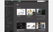
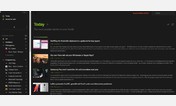
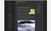
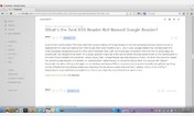

Sabre@userstyles deleted this style because of "Broken and not worth keeping around."
Try The Dark and Flat - Feedly instead of this deleted style.
See more styles for Feedly
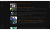
Feedly Super Condensed Edition
Description:
It has only been tested for personal use on my 1366x768 Firefox, and will most likely break on everything else. If it does, I would be grateful for anyone willing to make a all-resolution port. Feedly homepage is broken - just click on the login button.
The basis of the style was pilfered from http://freestyler.ws/style/79641/feedly-wide-and-clean-like-google-reader.
More info
- Works with all views, but best used in Titles view. Click on the gear icon to check out the different views.
- To open a folder, click to the left of its title label (where the plus would be).
- To search entries, click on the "Add Website" button. It does the same thing as the Search thing on the right.
16-3-2013 - Add button now shown, further condensing
15-3-2013 - Initial
First install FreeStyler to use this style.
If you already installed it, please, make sure this site is allowed to run JavaScript.But you can download Freestyler for other browsers and apply styles there!
Applies to:
feedly.com