Related styles:
-
NY Times paywall crack
Installs:Created: Mar 27, 2011Last Updated: Mar 28, 2011 -
Created: Oct 30, 2010Last Updated: Oct 31, 2010
-
Created: Sep 21, 2009Last Updated: Oct 29, 2009
-
Created: Jan 20, 2008Last Updated: Sep 08, 2012
-
Created: Aug 10, 2007Last Updated: Aug 21, 2011
-
Created: Dec 18, 2009Last Updated: Sep 09, 2010
-
Created: Nov 30, 2006Last Updated: Mar 02, 2008
-
Created: Sep 21, 2007Last Updated: Nov 05, 2008
-
Created: Feb 25, 2011Last Updated: Apr 04, 2011


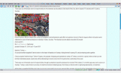



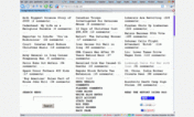


Webb@userstyles deleted this style because of "Broken after site redesign 5 May 2011."
Try Darker Lifehacker instead of this deleted style.
See more styles for Lifehacker
Lifehacker eXtreme version
Description:
This works on Lifehacker blog. Not tested on other Gawker blogs.
Lifehacker has made its comments section incomprehensible. I've tried to make it a little more readable but it's still incomprehensible.
The comments are now in a frame - http://api.gawker.com - so if you remove the domain(gawker.com) namespace they won't appear correctly.
25 August 2012
It is getting more difficult to update this style as the site's styles change almost daily. This is a pretty good effort but it may be time for a complete rewrite.
First install FreeStyler to use this style.
If you already installed it, please, make sure this site is allowed to run JavaScript.But you can download Freestyler for other browsers and apply styles there!
Applies to:
blog.lifehacker.com, lifehacker.com, deadspin.com, gawker.com... More »